Showing posts with label print. Show all posts

Saturday, January 10, 2009

It's Not Easy Being Green

A new year, a new you! As the Green movement continues to sweep the world, it's leaving no stone unturned. Literally. I'm all for recycling and reducing carbon footprint and general responsible living. But sometimes the movement aims beyond its reach and can come out looking foolish. 

Case in point, a new typeface unveiled by our forward-thinking Dutch buddies, aptly named:

The reaction:

1. Creepy! The holes should rather be dots. I get that they're going for something new and fresh. But again, still creepy. 

2. Impractical! I can't see an appropriate use for this type. It might as well be a lit up marquee sign. But aside from that application, it has no home. Maybe it could be an animated font with the holes/dots blinking. Or better yet, chaser lights. Yeah! No.

3. Cheesy! Why does the name have to have the word "font" in it? That alone adds a measure of cheesiness that, I suppose, is only fitting since it exhibits a swiss cheese likeness. That, or termite damage. 

4. Mediocre! There are better ways to save ink. Like using a thinner stroked font or grayscale. Or, better yet, manipulate the most versatile font ever designed to use less ink. Like this Linotype Punkt, which comes in Light, Regular and Bold. Just like your coffee.

Above: Linotype Punkt Regular

So, the lesson here is sometimes, the greenest solution is just to recycle.

Until Next Time,
Font Police

(Tip Credit: Agent Kerning) 

Friday, October 3, 2008

Five Things I Hate About Papyrus

Print advertisement in the Seattle Weekly 10.01.08.
Papyrus promises adventures with other singles! That's hot!
Not.


Signage on the 12th Avenue Corridor in Seattle.
At least they had the sense to use Century Gothic in most of the text.
But still, it doesn't cover over the most heinous of sins. 


Not even sure what this is, but I found it on a storefront in Pioneer Square.
It's not even a real word. Is it a bar? A restaurant? 
Really, I don't care. Just stop the insanity!


Enough is enough is enough.
Papyrus needs to be banished!
Its users and abusers need to be called out.
Trust me, I'm not alone in this. 
I mean, there's a whole blog dedicated to one man's ironic love of the type.
Join the public outrage! 
Why? 
Here is a handful of reasons...

In no particular order:

1. Papyrus takes up too much room. 
It's awkward and ugly. It has no respect for the negative space. The capital letters are most offensive. Especially the rounded ones - B, P, R, S. Just imagining these characters in my mind makes me wince in pain. So I'll stop now before I start to have a seizure.

2. Papyrus is not actually written on papyrus.
In an age of laser printers and glossy paper, not to mention digital imagery, YTF is Papyrus an appropriate font for anything? I'm done. If you don't get it, it's probably because you wish I was writing this in Papyrus. While I'd rather be writing on papyrus. Excuse me while go in the corner and throw up in my mouth.

3. Papyrus looks like the word platypus. 
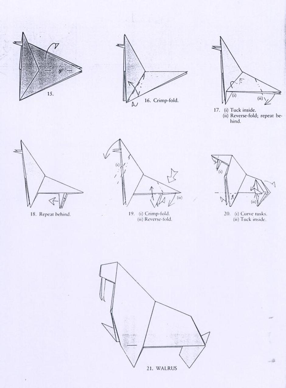
Platypus is a much cooler word and a much cooler animal. Papyrus sounds like it could be some strange hybrid animal: an origami walrus, perhaps? It's bad enough that there's a paper/card company called Papyrus (various locations). Let's not add to the overexposure of this ancient form of media, lest we weaken the impact of its invention.

4. Papyrus is overused. 
And its (ab)users should have their computers revoked! It's everywhere. In print. On storefronts. On signage. In websites. On t-shirts. 

5. Papyrus has become the official typeface for a certain lifestyle.
If you look at it, the font actually evokes a feeling of sacredness. It looks old and wise. Like it cares about your wellness and encourages you to do yoga everyday. Makes you hungry for some delicious asian food. And then promptly eject it from your mouth. Wait, that's just my response.

Rest assured, this list is not exhaustive by any means. We will revisit and continue to embarrass publicly the offenders of typeface. In the meantime, marinate on this post and let your anger swell. 

Yours Truly,
Font Police