Thursday, October 30, 2008

The Sound That It Makes

There are more examples of poor typeface selection than there are appropriate. Or, to go a step further, what will from this point on be referred to as fontomatopoeia (definition: words whose typeface matches perfectly the structure of the word itself as well as its definition). Therefore, on the rare-ish occasion that one encounters an instance of fontomatopoeia, well, it must be celebrated, documented and shared in order that the masses may know what is good and right for the betterment of their future typeface decisions. So, this entry is dedicated to one of my favorite cities: New York. 

exhibit at the MoMa


max brenner's wares


store signage in greenpoint

Until next time,
Font Police

Thursday, October 16, 2008

For Nostalgia's Sake

So you think you can win us over with a dose of nostalgia, do ya? Sure, we grew up on lame birthday parties at the laser tag arena. And Teen Wolf (some may argue both the original and the sequel) is a classic in our minds and hearts. But you think that is enough to convince us to eat at your fine dining establishments? Well, for the desperately hungry, no convincing is really ever necessary. But for the discerning diner with a penchant for aesthetics and a graphically-inclined appetite (presentation is important, after all) and the curiously un-opinionated, here are my thoughts from the heart...

Dear McDonald's,

Are you serious? You are a (some may argue the) major big, bad corporation in the universe and you have deviated from the graphic standard of the McDonald's logo and typeface. Sure, you will still have drones of people come into your restaurant, but in passing your Seattle store on Madison Avenue, it confused me. What was the meaning of this? I'll keep this to a three-pointer:

1. You're deviating from standard protocol. That's not like you. Hopefully, you've learned your lesson. 

2. This Teen Wolf Typeface is neither appropriate for McDonald's nor any illuminated sign that was fabricated in some warehouse and installed on site by a contractor...and not actually brushed on the side of the building. It looks like an all-too elaborate tagging extravaganza.

3. It's ugly. I hope you canned the individual that even suggested such a move.

You're welcome.

Sincerely,
Font Police.

Teen Wolf inspired McDonald's Signage in Seattle.

Next...

Dear Brothers BBQ,

I have to be completely honest. In my years residing in Denver, I would drive past your 6th Avenue location many-a-time. As much as I love a good BBQ (and trust me, the aromas emitting from this location infiltrated the entire neighborhood and often enticed me), I resisted. For four years. Resisted even entering your establishment. Why? I'll tell you why. Because I was afraid. Afraid that my expectations for some delicious BBQ pulled pork would be met only with the disappointment and embarrassment of walking into a a dark room, getting strapped with a bullet-proof-ish vest-like garment, handed a fake gun and thrown into an obstacle course of shooting in a room filled with guests of a middle-school birthday party! A nightmare of mine, on many levels. 

Eventually, I did try your restaurant, and much to my relief there was no tagging with lasers, thankfully. But I have to say, I only went there because it was the closest available place to eat while waiting for the next show at the Esquire. I implore you, dear Brothers B, please do yourself (and every potential new customer) a favor and change your logo. It'll do you good.

You're welcome.

Sincerely,
Font Police

Laser tag inspired Brothers BBQ in Denver.
(photo cred: Agent Kerning)

Until next time....

Font Police

Friday, October 10, 2008

Clash of the Typefaces

Storefront in Ballard

What is wrong with this picture? Or rather, what isn't wrong with it? At first glance, it was the cliche application of the beloved papyrus that caught my eye. But as I stepped closer and closer to the storefront window to take my photograph, I was overcome with a wave (pun not originally intended, but I'll take it!) of emotions ranging from confusion to anger to sadness. 

Oh, dear sweet 8 lb. 4 oz. lil' baby Jesus, where to begin?

Overrated Typeface
No-brainer. Refer to original post about it. Moving along...

More is More
Two-toned, outlined font. I'm not even going to indulge you on the tragedy of the chosen color here. Let's move on before the vomiting in mouth commences...

Faux-Geek
The weak attempt at helping people pronounce rejuvenation. Because there is a long-running debate on how to properly pronounce the word. Right. C'mon. It's not like trying to pronounce !Xobile. But, seriously, if you're gonna go there, why stop at syllables and accents? Where's the schwa? (hint: the 'e' in 've') The short/long vowel symbols? Go hard or go home. Next...

The Wave
Better left to baseball games and surfing and greeting people from afar. Next...

Improper Engagement
Incorporating the window mullion into the signage. It's like breaking the fourth wall in acting, except we're not acting and I'm going to take a wild guess and say that it was not intended as an artistic maneuver to challenge the onlooker into reevaluating their view on two-dimensional vinyl graphic signage. Gonna guess it was someone's low-fi "solution" to a "problem" or something of the sort. I'm......without words....(well, without more words)... Next...

Inconsistency
Not incorporating the window mullion into the wavy waves graphic that is part of the Papyrus text. Forgive me, but it just had to be said.

This may be another example of storefront signage that causes such pain and anguish that the very thing they are selling is what will ease such pain and anguish. Sort of like the high density of fast food businesses surrounding the vicinity of many-a-24 hour fitness franchises. 

I dunno, just an observation.

Until next time,
Font Police

Friday, October 3, 2008

Five Things I Hate About Papyrus

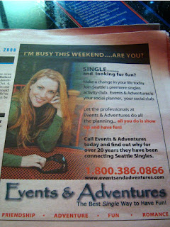
Print advertisement in the Seattle Weekly 10.01.08.
Papyrus promises adventures with other singles! That's hot!
Not.


Signage on the 12th Avenue Corridor in Seattle.
At least they had the sense to use Century Gothic in most of the text.
But still, it doesn't cover over the most heinous of sins. 


Not even sure what this is, but I found it on a storefront in Pioneer Square.
It's not even a real word. Is it a bar? A restaurant? 
Really, I don't care. Just stop the insanity!


Enough is enough is enough.
Papyrus needs to be banished!
Its users and abusers need to be called out.
Trust me, I'm not alone in this. 
I mean, there's a whole blog dedicated to one man's ironic love of the type.
Join the public outrage
Why? 
Here is a handful of reasons...

In no particular order:

1. Papyrus takes up too much room. 
It's awkward and ugly. It has no respect for the negative space. The capital letters are most offensive. Especially the rounded ones - B, P, R, S. Just imagining these characters in my mind makes me wince in pain. So I'll stop now before I start to have a seizure.

2. Papyrus is not actually written on papyrus.
In an age of laser printers and glossy paper, not to mention digital imagery, YTF is Papyrus an appropriate font for anything? I'm done. If you don't get it, it's probably because you wish I was writing this in Papyrus. While I'd rather be writing on papyrus. Excuse me while go in the corner and throw up in my mouth.

3. Papyrus looks like the word platypus. 
Platypus is a much cooler word and a much cooler animal. Papyrus sounds like it could be some strange hybrid animal: an origami walrus, perhaps? It's bad enough that there's a paper/card company called Papyrus (various locations). Let's not add to the overexposure of this ancient form of media, lest we weaken the impact of its invention.

4. Papyrus is overused. 
And its (ab)users should have their computers revoked! It's everywhere. In print. On storefronts. On signage. In websites. On t-shirts

5. Papyrus has become the official typeface for a certain lifestyle.
If you look at it, the font actually evokes a feeling of sacredness. It looks old and wise. Like it cares about your wellness and encourages you to do yoga everyday. Makes you hungry for some delicious asian food. And then promptly eject it from your mouth. Wait, that's just my response.

Rest assured, this list is not exhaustive by any means. We will revisit and continue to embarrass publicly the offenders of typeface. In the meantime, marinate on this post and let your anger swell. 

Yours Truly,
Font Police